The release of the next LibreOffice version is not that far away with a lot of cool new features. Additionally to the many nice features already mentioned on our Release Notes page I want to talk a bit about one of the new chart features that will be part of the 4.3 release.
What is property mapping and how to use it in a chart?
Property mapping is a way to map a property of a chart series, for now fill color and line color, onto a data range in a spreadsheet. Based on the value in the spreadsheet the property value is changed.
If this sounds familiar you are correct. Inside spreadsheets you have a similar feature called conditional formatting that allows formatting of a cell based on a spreadsheet value. Until now all the chart formatting was either fully automated based on default values in the LibreOffice code or hard formatting. The new “conditional formatting” for charts allows us to dynamically adapt the chart formatting based on the data in our spreadsheet.
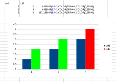
A simple use case for this feature is to highlight special values in your chart. In older versions you would need to modify the formatting of the chart each time your data changed. With this new feature you just have an additional column where you calculate the color automatically based on the value of the point. In the screenshot below data series “col2” has a property mapping that formats the bar red if the value is larger than 3, otherwise green.
How do you add a property mapping to a chart?
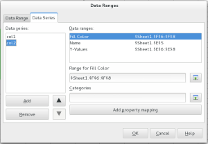
Adding a property mapping is quite simple. In the chart wizard or in the data ranges dialog select the data series and add a property mapping based on the list shown after clicking on the “Add property mapping” button (The available mappings depend on the chart type). In the next step set the range property for the mapping as shown in the screenshot.
The feature is already working quite nicely in current daily builds however I’m aware of some open items that need improvement. The UX team asked for a few changes to the dialog and in my opinion there needs to be a way to prevent that empty cells are treated as 0 (black). I think it might be a better idea to use the series color in case we find an empty cell.
Additionally the concept is still a bit user unfriendly. The mapping is based on implementation defined property values and calculating the correct RGBA value needs some experience. A small step into a more user friendly handling is the addition of the COLOR spreadsheet function that takes 3 (RGB) or 4 (RGBA) parameters and returns the correct value.
Testing in a daily build is highly appreciated. Additionally I’m still looking for ways to extend property mapping to non-color properties but I’m missing a good concept. If you have an idea for a good mapping between values and properties please drop me a note.


You noticed the conditional formatting as a related concept.
Well, this feature should exactly follow the concept: you should not require some obscure formatting columns; instead, you should give user a good old conditional formatting dialog for each data series (using your button), and there define value ranges and formatting for each range (here, you may define color of bars and points, their fill pattern and shape, maybe some additional text…) That would be:
– more user-friendly (no need to use a programming-like approach);
– more intuitive (no need to grasp a new concept for a similar task);
– more flexible (add any formatting you want to value range; no need to use a different value range for other property – say, for pattern).
Thanks a lot for your excellent work on Calc and Chart! It is highly appreciated.
it’s really cool.
The CELL coloring is a feature that I’ve been waiting for ages. Hope this step make it closer to be a reallity 🙂
Pingback: LibreOffice 4.3.0 and 4.2.6 are out | goFLOSS!
Hi,
It would be extremely helpful if you
a/ could orient the interested user to some how-to, step by step guide, or a worked example,
b/ could tell us which chart types work with property mapping and which not.
I thought the most evident use is for a XY scattergram in which you categorise the XY coordinates through a third, categorical variable. But maybe I am wrong.
BTW: finding the color through RGBA values should rapidly be changed. This is easy for developers only.
In fact, for a XY scatter which you use often in research you either use a categorical variable to show types (for instance, age by weight for men, compared to age by weight for women) or use them as a rank variable (age by weight for no-sports people, for beginners, for amateur sports people, for professionals sports people). The rank variable can also be a regrouped continuous variable (for instance, population density : in sparsely and in densely populated regions).
In all of those cases you would not like to use colours in a fancy, uncoordinated way, but as a graduated scale: from blank via grey scales to black, from blue to red, etc. Such scales should be proposed when you look for the mapping category. To me, RGB colours seem to be useless, at least they inhibit the use of this excellent innovation for the ordinary LibO user.
Cheers,
ftr